Fonts Have Feelings Too: Choosing Typefaces That Actually Match Your Brand
Fonts do more than spell out your brand name—they set the tone for how your brand is perceived. Whether it's bold and confident, soft and nurturing, modern or nostalgic, the typeface you choose plays a powerful role in defining your brand's voice.
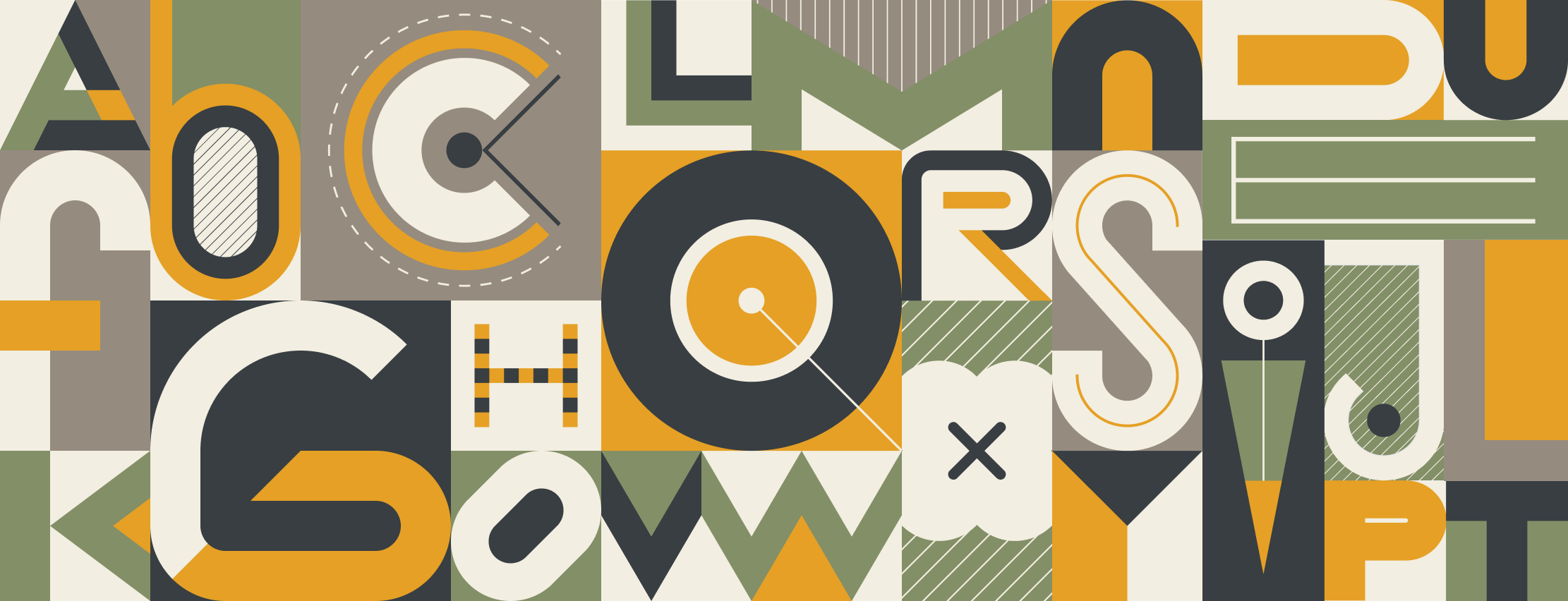
We believe fonts are one of the most underutilized tools in a brand’s toolkit. From logos to websites to social posts, typography influences how people feel about your brand before they even read a single word.
Why Font Choice Matters
Fonts trigger instant emotional reactions. Research shows that typefaces can influence trust, mood, and perception. For example:
Serifs (with little decorative feet) often feel traditional and trustworthy—perfect for heritage brands or institutions.
Sans-serifs (clean and modern) convey simplicity, friendliness, and innovation—popular with tech and startup brands.
Scripts and handwritten fonts feel personal and emotional, often used by creative or lifestyle brands.
The key is matching your brand personality with a font that visually expresses it—consistently across all platforms.
Font Personality Types (and Who They Work For)
Here are some common font personalities and the kinds of brands they typically suit:
Modern: Clean, sleek, and up-to-date. Great for tech companies, startups, and innovative brands.
Playful: Fun, quirky, and full of character. Ideal for entertainment brands, children’s products, or casual eateries.
Bold: Strong and attention-grabbing. Works well for athletic brands, fitness companies, and high-impact advertising.
Elegant: Sophisticated and timeless. Perfect for luxury brands, fashion labels, and upscale services.
Classic: Traditional and dependable. Trusted by banks, universities, and long-standing institutions.
Minimalist: Understated and neutral. Great for modern lifestyle brands and clean, design-forward identities.
Real-World Examples
Google shifted from serif to sans-serif to signal a more approachable, digital-first identity.
Coca-Cola’s signature script evokes nostalgia and timelessness—still used on packaging, merch, and media.
Chanel uses a high-contrast serif that immediately signals elegance and heritage.
Disney’s whimsical script logo feels magical and imaginative—an instant cue to the brand’s playful spirit.
Each of these brands uses typography to tell a consistent, emotionally resonant story. And they use it everywhere—from their website headers to their smallest social icons.
Tips for Choosing the Right Font
Know Your Brand Personality: Identify the traits you want to express—fun, authoritative, premium, welcoming—and pick a font that reflects them.
Test for Versatility: Make sure your typeface works on web, social, print, and at various sizes.
Stay Consistent: Use your brand fonts everywhere to create a cohesive, memorable identity.
Think Long-Term: Choose a font that can grow with you. If your brand evolves, your typography should still align.
Fonts aren’t just a design choice—they’re a brand signal. The right typeface brings your personality to life, shapes perception, and builds recognition across every platform.
At Joba, we specialize in crafting thoughtful brand systems—fonts included—that feel just as good as they look. If you're building a brand or rethinking your identity, we’d love to help you find the type that speaks your language.